Collabo
What does an online conferencing platform for undergraduate meetings look like?
What A course on User Experience Design in the National University of Singapore
Who Student designer (Me) + 4 student designers
What I Did Designed and conducted quantitative and qualitative user research to gather insights
+ Synthesised insights into UI & UX requirements, design and an online paper prototype
+ Evaluated design with users and against usability heuristics to identify problems and areas to improve on
Results A proposed design for a platform tailored to undergraduates, and an A grade for the course
Amidst the pandemic, we turned to online conferencing out of necessity – but even as we return to "normalcy", it has remained popular. However, most platforms (in 2023) are made for a general audience, leading to gaps in support.
This project reimagines how online conferencing can be tailored to benefit a specific target user – in this case, we've targetted undergraduates.
Problem + Background
– tailoring online conferencing platforms to benefit any specific group
In this course, we were to work in a group to design a simple desktop-computer-based interactive system, carefully targeted to address the problems and needs of any user group of our choice.
My group chose to target university undergraduates who frequently use video conferencing platforms to engage in small group discussions for school. The specific age group is from 18 to 25 years old.
User Testing
– learning about what delights or disrupts undergraduate meetings
As much as we want to alleviate users’ frustrations when it comes to having small group meetings online, we also wanted to find out about what users currently enjoy in order to incorporate it into our final design. This would also allow us to take advantage of what is currently being done well by existing platforms.
We wanted to identify broad trends but also more nuanced details, thus we conducted an Online Survey via Qualtrics with over 50 respondents, and followed it up with two Focus Group Discussions of 5 participants each.
Questions to both methods were crafted as a group.
Online Survey
This helped us understand the current landscape of student habits. It offered insights to the video conferencing platforms that were popular among students, and which of their features served to delight or annoy users who use them for small group meetings.
Pictured right: questions and MCQ options from the Survey
The survey asked about the students' background, which platforms they used, and what they thought about them. Questioned were primarily MCQ questions, with some requiring respondents to rank their opinions on a 7-point Likert scale.

Helpfully, we were able to generate a report from Qualtrics which summarised the results from the Survey. This allowed us to easily analyse the data and note down the key findings.
Pictured right: a section of the Qualtrics report, showing results of the 7-point ranking question
From this, we found that many users faced difficulties identifying when to speak in a meeting without interrupting someone else.

Focus Group Discussions
This allowed us to gather more in-depth data on students' attitudes and experiences with online small group meetings. We opted for Focus Groups over Interviews as it allowed us to better identify common points of delight and pain points among our target users, thus helping us better identify the problems that we can help to address through our product.
Participants came from different faculties and years of study. Each Focus Group Discussion was led by a facilitator from our group, one of them being led by me, who recorded the session for further analysis.
Pictured right: questions asked in the Focus Group Discussion

We analysed the findings on an online whiteboarding platform, Miro, and did an affinity mapping to identify the main themes of participants' responses.
Pictured right: our final affinity map
Pictured below: summary of key insights


Ideate – translating insights into design requirements
To aid the ideation process, we first developed two personas which are distinguished based on their goal for the meetings. Their motivations and frustrations have also been aligned with the respective goals of the user.


Given the short timeline, we decided to focus on solving only 3 of the problems we identified. This allowed us to maintain a manageable scope and ensure that we could dedicate more time to solving these problems. The following are the requirements we decided to focus on:
Requirement #1
Offering social translucence while maintaining privacy
While the functionality exists, we found that small group meetings among students often took place with cameras turned off. Students cited privacy as a reason for this.
However, this common practice translated into a lack of social cues, resulting in frequent unintended interruptions during discussions.
Requirement #2
Integrating collaborative tools & managing screen space
Our research found that users often held online meetings to collaborate on work or brainstorm ideas. As such, they often used other collaborative tools alongside the video conferencing platform itself.
This resulted in the need to toggle between the call and other collaborative tools that were used, creating difficulties due to the lack of screen space.
Requirement #3
Improving system visibility through real-time feedback
Another key problem that emerged in our research was the lack of clear system visibility (e.g. participants' disconnection, unintended muting which can be disruptive to group discussions online).
The lack of visibility resulted in frequent disruptions to the online meeting, which in turn disrupted students' ability to do work.
Prototype – crafting a preliminary design
Given the nature of the introductory course, we were asked to make a simple "paper" prototype online to present and test our ideas. Our group thus made our screens on Miro, an online white-boarding software.
While the prototype itself was not interactive, we were able to drag elements around to mimic the interactions. This was also how we used the screens we designed to conduct user testing.

Requirement #1 – Offering social translucence while maintaining privacy, in light of many users not turning on cameras during meetings
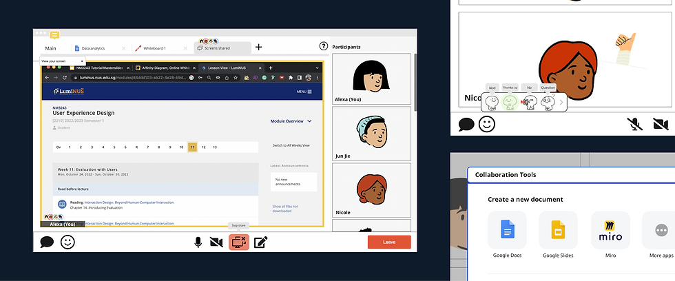
Mic Hover – To avoid unintentionally cutting others off, we wanted to mimic the social cues of an in-person conversation. When users hover over the microphone button, a speech bubble appears next to their avatar to indicate to others that they would like to speak.
Joining as an Animated Avatar – To maintain privacy while preserving social cues, users will join meetings with an animated avatar that reacts or responds when desired. The avatar will be the default setting on the platform to fill the need for social cues.

Requirement #2 – Integrating collaborative tools & managing screen space, for students who often use multiple tools at once during meetings
Integrated collaboration tools – to minimise the need to exit the platform, commonly used collaborative tools will be integrated into the platform itself
Tab system – to manage tools alongside a call, the platform will use tabs and be organised like a web browser
Avatar icons – a small avatar appears on the tab you're on, allowing others to see what you are looking at and you to see the same for others

Requirement #3 – Improving system visibility through real-time feedback, to ensure users are aware of their mic, video and connection status
Notifications – when the audio is turned on or off, a notification sound will play to alert the user to the action, in case it was unintentional

Evaluate – finding out if our design solved the desired problems
To assess our design, we carried out 2 forms of evaluation, namely User Testing and a Heuristics Evaluation. These methods allowed us to gather insights from our users on how helpful our design was, while allowing us to assess the usability of the design as well.
User Testing
We conducted user testing sessions with 5 university students to evaluate our proposed design. The sessions were performed on Miro, with a member of the group as a facilitator to instruct users to perform various tasks, and another member to record observations.
Our observations were logged down for further analysis, and allowed us to identify the key problems with the proposed design.

Proposed Re-design
While the project timeline did not allow us to do an extensive redesign of the prototype, we identified possible changes that could be made to address the key problems identified in the user testing. The following are the 2 key problems, and how we addressed them.
Problem #1 – Lack of clear distinctions between states
The design lacked clear visual distinctions between functions like screen shares & collaboration tools. As such, users were confused about whether they were looking at a shared screen (not editable), or the editable collaboration tools.
Modifying visual indicators – We added a coloured border to shared screens, creating a visual distinction between the two states.

Problem #2 – Mismatch in how users thought the integrated tools worked, and how it actually was intended to work
The prototype allowed users to open the integrated tools by clicking either the “+” sign or the pencil icon. However, the 2 distinct features resulted in users believing that they each had distinct functions. Having both features results in the same outcome, thus creating confusion.
Clarifying the UX of the "+" and the pencil icons – To bridge the gap in understanding, the functions of the 2 icons were made distinct, with the "+" icon opening collaborative tools only, while the pencil icon opened whiteboards only.

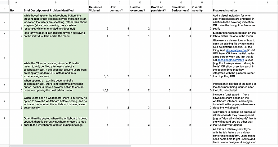
Heuristic Evaluation
After redesigning our solution according to the problems identified, we conducted a heuristic evaluation of our system using Jacob Nielsen’s 10 Usability Heuristics.
For each problem, we identified the heuristic(s) violated and gave ratings on how common, how hard to overcome, whether the problem is on-off or persistent, and what the perceived seriousness is. With those ratings in mind, an overall severity rating is given to the problem. We also came up with proposed changes to solve the identified problems.
Concluding Thoughts
The two evaluations thus concluded the project. While it was a relatively short one, it exposed me to a relatively holistic experiencing conducting research, ideating based on the research, and proposing a design for a product.
Granted, this project explored the User Experience dimensions of UI/UX Design, focusing more on collecting data before and after the prototype was created. While I did not manage to do as much user interface design in this project, I did manage to do so in another project, which you can check out here:
UX Design, UI Design, Prototyping
